프로젝트가 가장 그다운 모습으로 완성되도록.
브랜드가 쌓아온 경험과 생각을 전략과 디자인으로 구현합니다.
Bringing every project to its truest expression.
We translate a brand’s experiences and ideas into strategy and design.

2026 Nungm
서랍을 정리하고 있어요!
We’re organizing the drawer!

연희회관 콘텐츠 운영 시스템 구축, 2026
연희회관은 어반플레이가 운영하는 쿠킹 라운지이자, 식음료 콘텐츠 창작자를 위한 공간입니다. 이 프로젝트에서 중요했던 것은 하나의 콘텐츠를 잘 만드는 일이 아니라, 공간 안에서 계속 만들어질 수 있는 콘텐츠를 효율적으로 운영할 수 있는 구조를 만드는 일이었습니다. 연희회관이 자체적으로 만들 수 있는 콘텐츠의 성격과 운영 방식을 살피고, 여러 카테고리의 콘텐츠가 각각의 역할을 하면서도 일관된 하나의 브랜드 콘텐츠로 보일 수 있도록 정리했습니다. 카테고리 브랜드, 콘텐츠 템플릿, 폰트, 컬러 등 반복적으로 활용 가능한 콘텐츠 시스템을 구축했습니다.
Yeonhui Hoegwan, operated by Urbanplay, is a cooking lounge and creative space for food and beverage content creators. The focus of the project was not on producing a single piece of content, but on building a system that would enable the space to create and manage content continuously and efficiently. We defined the roles and structure of different content categories and developed a reusable content system—including category identities, templates, typography, and color—so that diverse content could remain distinct while still feeling like part of one cohesive brand.

2025 KTSC
서랍을 정리하고 있어요!
We’re organizing the drawer!

수원정자시장협동조합 PB상품 브랜딩, 2024
수원정자시장 상인들의 상품과 노하우를 바탕으로, 시장 밖에서도 경쟁할 수 있는 PB 브랜드의 기반을 구축했습니다. 개별 상품의 패키지를 넘어 앞으로 개발될 다양한 상품을 하나의 인상으로 연결할 수 있도록 브랜드 체계를 설계했습니다. ‘정성 담아, 자부심 담아’라는 메시지에서 브랜드명 정담자담을 개발하고, 상인들의 정성과 자부심을 브랜드의 핵심 가치로 정리했습니다. 수원과 정자시장의 지역성은 붓의 질감을 활용한 시각 언어로 표현해 전통시장이라는 출처와 독립적인 상품 브랜드의 인상을 함께 담았습니다. 향후 다양한 PB 상품과 유통 채널로 확장할 수 있는 지속 가능한 브랜드 시스템을 구축한 프로젝트입니다.
Built on the products, expertise, and stories of merchants at Suwon Jeongja Market, this project established the foundation for a PB brand designed to compete beyond the traditional market. Rather than designing a package for a single product, we created a brand system that could connect future products under one consistent identity. The name Jeongdam Jadam was developed from the idea of “made with care, made with pride,” reflecting the dedication and confidence of the merchants behind each product. Local references to Suwon and Jeongja Market were translated into a distinctive visual language using expressive brush textures, balancing a clear sense of origin with the presence of an independent product brand. The result is a scalable brand system designed to support future product development and expansion across both online and offline distribution channels.

스터디패스 브랜드 아이덴티티 개발, 2024
스터디패스는 MBA 합격을 준비하는 수험생들을 위한 전문 교육 브랜드입니다. 이 프로젝트에서는 단순히 학원처럼 보이는 디자인보다, 수험생이 중요한 커리어 전환을 믿고 맡길 수 있는 신뢰감 있는 브랜드 이미지를 만드는 데 집중했습니다. 긴 준비 과정에 필요한 것은 일회적인 홍보보다 체계적으로 이끌고 끝까지 함께하는 전문가의 태도라고 보았습니다. 이에 로고, 컬러, 그래픽 요소와 적용 기준을 정리해 웹사이트, 인쇄물, 상담 자료 등 온·오프라인 전반에서 일관된 브랜드 경험을 설계했습니다. 이를 통해 스터디패스만의 전문성과 안정감이 지속적으로 드러날 수 있는 비주얼 시스템과 디자인 가이드라인을 구축했습니다.
StudyPass is a professional education brand for candidates preparing for MBA admissions. Rather than simply creating the look of an academy, we focused on building a brand that students could trust with an important career transition. We believed the brand needed to convey the attitude of a reliable expert—one that could guide students systematically and stay with them throughout a long preparation process. To achieve this, we defined the logo, color palette, graphic elements, and application principles across both online and offline touchpoints, including the website, print materials, and consultation tools. The result is a consistent visual system and design guideline that reinforces StudyPass’s professionalism and stability across every brand experience.

ONE GROVE
서랍을 정리하고 있어요!
We’re organizing the drawer!
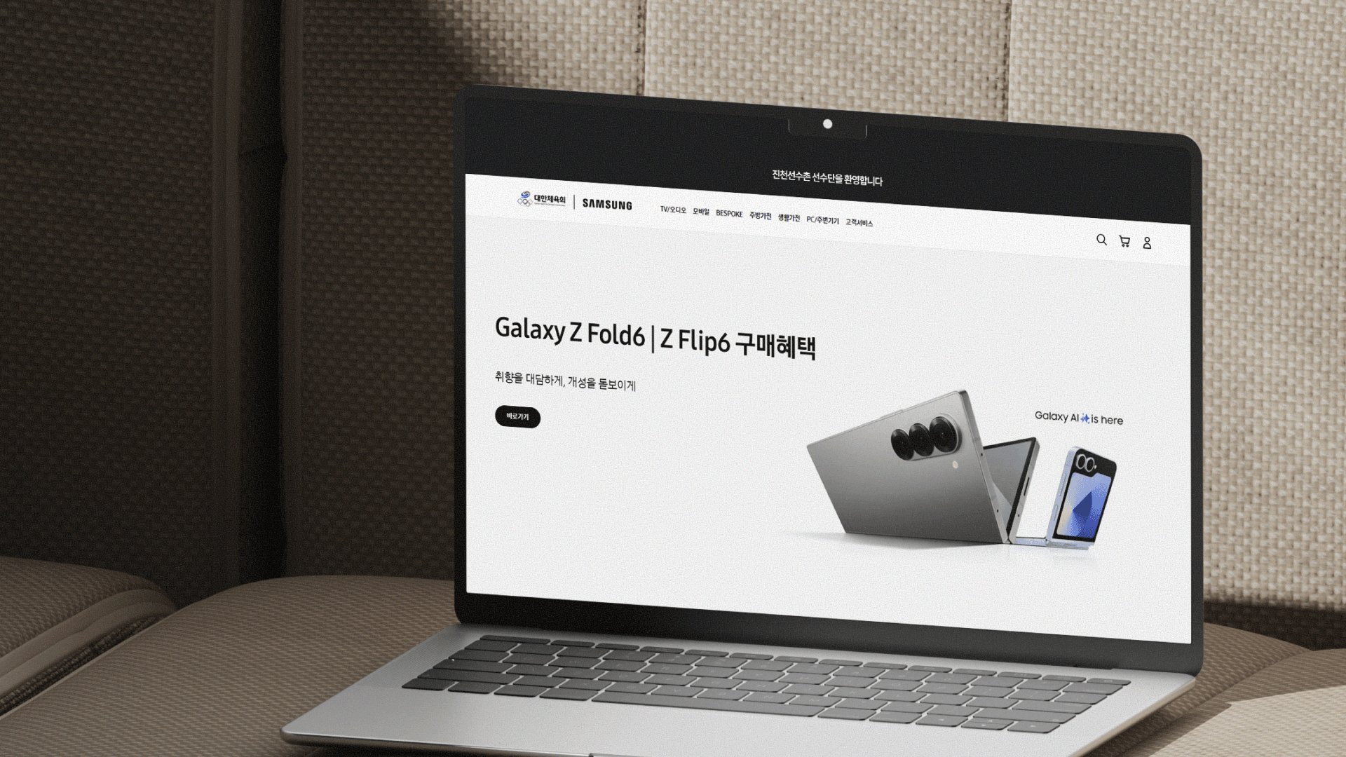
에듀에이드 B2B 복지 플랫폼 제안서 디자인, 2023
기업 복지 서비스를 운영하는 B2B 복지 플랫폼 에듀에이드의 제안서 디자인 프로젝트입니다. 복잡한 기능과 다양한 제휴 혜택을 기업 인사담당자의 관점에서 재구성해, 서비스 도입의 필요성과 기대 효과를 빠르게 이해할 수 있는 제안 체계를 설계했습니다. ‘행복한 일터의 시작’이라는 핵심 가치를 중심으로 플랫폼의 기능을 조직과 구성원에게 제공하는 실질적 가치와 연결하고, 제안서 전반의 정보 위계와 메시지 흐름을 정리했습니다. 태블릿과 PC 환경에서는 가독성과 탐색성을, 대면 미팅용 인쇄물에서는 기업 서비스에 필요한 신뢰감과 무게감을 고려해 매체별 레이아웃을 차별화했습니다. 기능 중심의 플랫폼 소개를 넘어, 복지 서비스가 기업과 구성원에게 가져올 변화를 명확하고 설득력 있게 전달하는 제안 시스템을 구축했습니다.
This proposal design project was developed for Eduaid, a B2B employee benefits platform providing corporate welfare services. The platform’s complex features and extensive partner benefits were restructured from the perspective of HR decision-makers, creating a proposal framework that clearly communicates the need for adoption and its expected impact. Centered on the core message, “The Beginning of a Happier Workplace,” the platform’s functions were translated into tangible value for both organizations and employees, with a clear hierarchy of information and messaging throughout the proposal. Digital formats for tablets and PCs prioritized readability and intuitive navigation, while printed materials for in-person meetings were designed to convey the credibility and weight expected of a corporate service. Moving beyond a feature-led introduction, the project established a persuasive proposal system that clearly communicates how employee benefits can create meaningful change for both companies and their people.
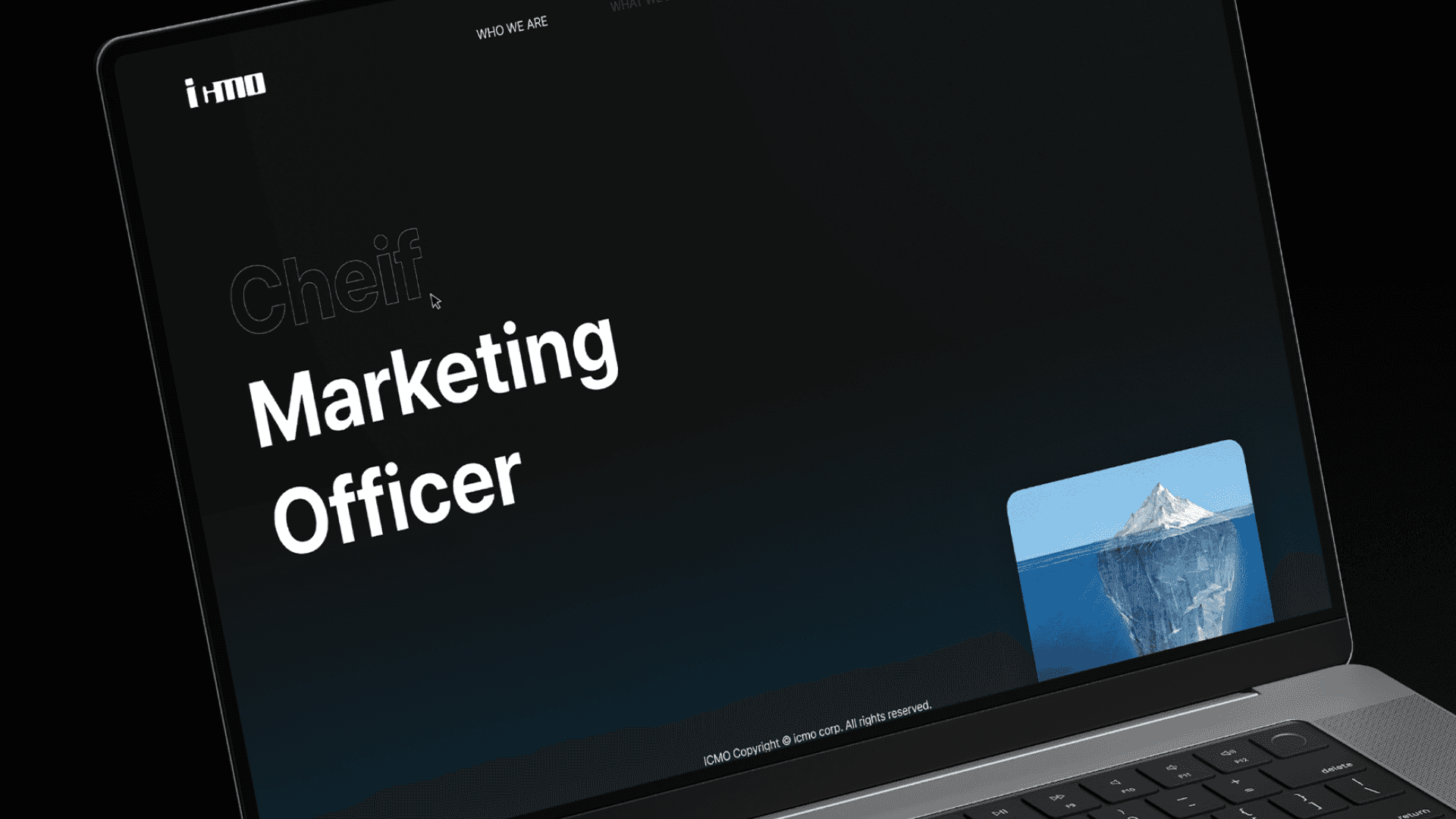
icmo 기업 브랜드 기준 및 아이덴티티 구축, 2023
두 명의 공동대표가 함께 이끌어온 14년차 마케팅 기업의 브랜드 리뉴얼 프로젝트입니다. 두 대표의 인터뷰를 통해 창업의 배경과 오랜 시간 지켜온 업무 방식, 고객과 프로젝트를 대하는 태도를 분석하고, 각자의 경험 속에 축적되어 있던 기준을 하나의 브랜드 언어로 정리했습니다. 성장 과정에서 흩어져 있던 초심과 아이디어를 핵심 메시지와 브랜드 원칙으로 구조화하고, 이를 비주얼 아이덴티티와 웹사이트 전반으로 확장했습니다. 새로운 이미지를 덧입히는 방식이 아니라, 이미 기업을 움직이고 있던 고유한 기준을 발견해 앞으로도 일관되게 활용할 수 있는 브랜드 시스템으로 구축한 프로젝트입니다.
This brand renewal project was developed for a 14-year-old marketing company led by two co-founders. Through in-depth interviews, we examined the company’s origins, long-standing ways of working, and approach to clients and projects, translating the principles accumulated through each founder’s experience into one shared brand language. Ideas and values that had become dispersed throughout years of growth were structured into clear brand messages and principles, then extended across the visual identity and website. Rather than imposing a new image, the project uncovered the principles that had already been driving the company and transformed them into a coherent brand system designed for consistent use and future growth.

치과 정보 플랫폼 브랜드 서비스 통합 디자인, 2023
치과 정보 플랫폼 ‘양치’의 브랜드 전략부터 앱 UX/UI, 그래픽 일러스트, 디자인 시스템, IR Deck까지 전반적인 브랜드 경험을 구축한 통합 디자인 프로젝트입니다. 어렵고 두렵게 느껴질 수 있는 치아·치과 정보를 누구나 편하게 이해하고 탐색할 수 있도록, 정보 구조와 인터페이스를 설계하고 친근하면서도 신뢰감을 유지하는 시각 언어를 개발했습니다. 브랜드의 유익함과 다정한 태도가 모든 접점에서 일관되게 전달될 수 있도록 디자인 시스템을 구축하고, 이를 앱과 다양한 커뮤니케이션 영역으로 확장했습니다. 또한 브랜드 전략을 기반으로 IR Deck의 메시지와 정보 흐름을 재구성해, 사용자에게는 쉬운 치과 정보 경험을, 투자자에게는 양치의 비즈니스 가치와 성장 가능성을 명확하게 전달할 수 있는 하나의 브랜드 체계로 연결했습니다.
This integrated design project established the overall brand experience for Yangchi, a dental information platform, spanning brand strategy, app UX/UI, graphic illustration, design systems, and its IR deck. To make dental and oral health information—often perceived as complex or intimidating—easier to understand and navigate, we designed the information architecture and interface alongside a visual language that balances approachability with credibility. A cohesive design system was developed to ensure the brand’s informative and considerate character remained consistent across the app and wider communication touchpoints. Based on the brand strategy, we also restructured the messaging and narrative of the IR deck, connecting the user experience and business story into one coherent brand system that clearly communicates both Yangchi’s value to users and its potential for growth.

Yangchi Graphic
서랍을 정리하고 있어요!
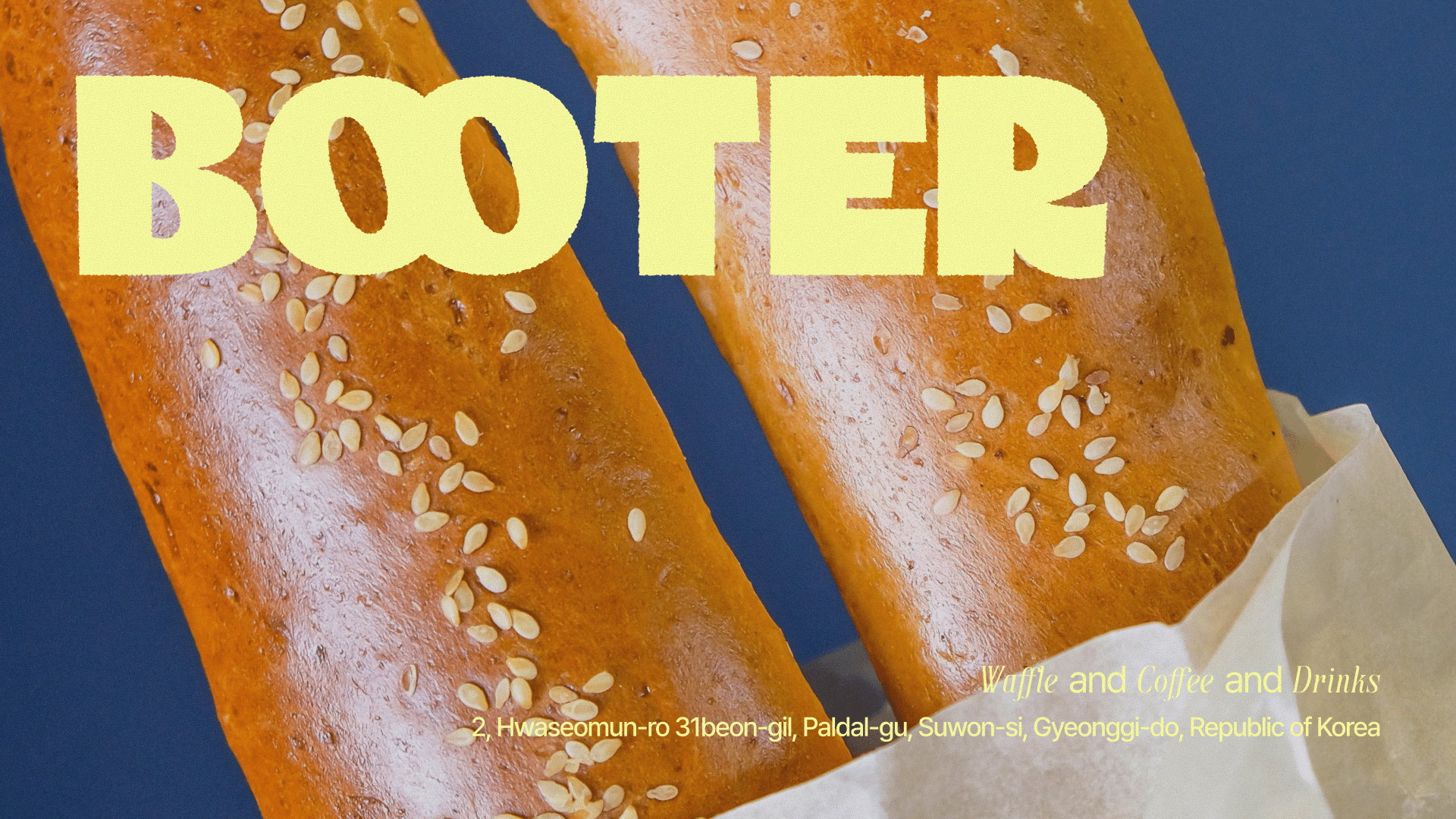
cafe BOOTER
서랍을 정리하고 있어요!
We’re organizing the drawer!
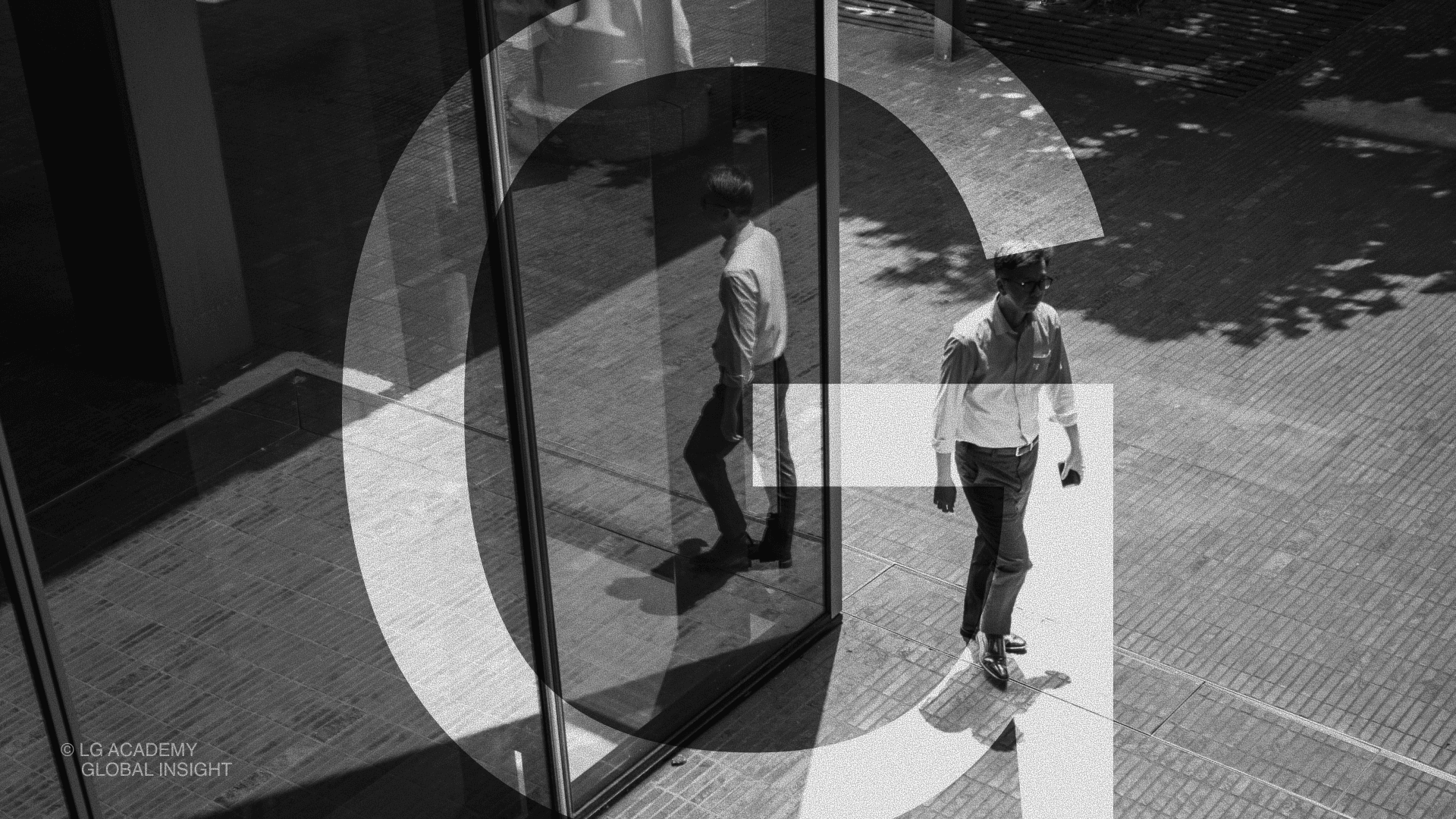
LG Academy 임직원 뉴스레터 디자인, 2021
LG 인화원의 임직원들을 위한 10편의 뉴스레터 디자인 프로젝트입니다. 좋은 콘텐츠도 읽히는 방식이 정리되지 않으면 쉽게 지나칠 수 있습니다. 이 프로젝트에서 중요했던 것은 글로벌 리더 TOP 10의 리더십과 경영 인사이트를 단순히 보기 좋게 꾸미는 것이 아니라, 임직원의 일상 안에서 자연스럽게 읽히는 콘텐츠 경험으로 바꾸는 일이었습니다. LG 그룹의 견고한 브랜드 아이덴티티를 바탕으로, 뉴스레터만의 감각적인 서브 브랜딩을 구축했습니다. 리더별 메시지와 복잡한 정보를 매거진형 레이아웃과 인포그래픽으로 구조화해, 경영 인사이트가 보고서가 아닌 읽고 싶은 콘텐츠로 전달되도록 설계했습니다.
LG Academy commissioned a 10-part newsletter series designed for its employees. Even strong content can easily be overlooked when the way it is presented is not carefully structured. The focus of this project was not simply to make the leadership and management insights of 10 global leaders visually appealing, but to transform them into content that employees would naturally want to engage with. Building on LG Group’s established brand identity, we developed a distinctive sub-branding system for the newsletter and organized complex information through editorial layouts and infographics. The result turned management insights from formal reports into clear, engaging content designed to be read.
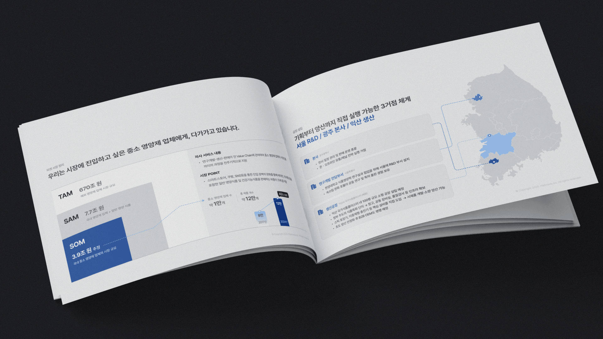
PADOTADA
서랍을 정리하고 있어요!
We’re organizing the drawer!

wewh
서랍을 정리하고 있어요!
We’re organizing the drawer!

삼성엔지니어링 임원 리더십 교육 저널, 2021
삼성엔지니어링 임원급 리더십 교육을 위해 제작한 교육 저널 디자인 프로젝트입니다. 텍스트 중심의 전형적인 교육 교재에서 벗어나, 리더십 교육의 핵심 내용을 보다 명확하고 몰입도 있게 전달할 수 있도록 콘텐츠를 재구성하고 정보 위계를 설계했습니다. 교육 내용을 압축해 읽기 흐름을 정리하고, 임원 대상 프로그램에 적합한 절제된 레이아웃과 편집 체계로 완성해 학습 경험의 집중도와 활용도를 높였습니다.
A leadership journal designed for an executive leadership development program at Samsung Engineering. Moving beyond the conventional, text-heavy format of educational materials, the project focused on restructuring the content and establishing a clear information hierarchy to communicate key leadership concepts with greater clarity and engagement. The educational content was distilled and organized to create a more intuitive reading flow, while a restrained layout and editorial system tailored to an executive audience enhanced both the focus and usability of the learning experience.
BUSAN SOCIAL OFFICE
StyleSeller
서랍을 정리하고 있어요!
We’re organizing the drawer!

CERTI
서랍을 정리하고 있어요!
We’re organizing the drawer!
